blessed_moon@studio
studio: Blessed Moon Studio
discipline: Strategy · Design · Engineering
stack: Next.js · Tailwind · WebGL
scene: ASCII moon · 5 keyframes
type: Space Grotesk / JetBrains Mono
accent: #ff6a1f
sound: muted
status: ready
B / S / MCASE_08 / 26

— Case study 08

Oishi Cozinha Japonesa

A rodízio's anti-waste pricing, built as the whole site's thesis

All work
oishi_cozinha_japonesa.capture● verified
Oishi Cozinha Japonesa hero with the 味 kanji set inside the hinomaru disc

project overview

A marketing site for a São Gonçalo rodízio restaurant with 17K Instagram followers and no website — every price, hour, and menu item is real, and the one thing the site exists to say is a real discount: R$ 20 off per person if the whole table finishes what it orders.

shipped outcome

Live at oishicozinha.vercel.app across five routes — home, cardápio, two rodízio chapters, reserva, and contato — where every price tier renders both numbers and the real condition, the reservation form ends in a pre-filled WhatsApp message, and the still-open questions about hours and party limits stay visibly marked rather than silently answered.

Role
Full-stack product engineering
Timeline
Ongoing
Year
2026
Team
Solo
The problem01

Oishi's entire web presence was a Linktree-style page and a one-screen Canva site. Its menu and four price tiers lived only inside JPEGs, reservations arrived by phone, and delivery ran through a third-party app. Its real differentiator — a genuine, checkable anti-waste discount — had nowhere on the internet to be said out loud.
The approach02

The whole site is built around one sentence already true of the business: 'Coma tudo o que pedir. Pague menos por isso.' Every rodízio tier always shows both prices together with the condition spelled out, never the discounted number alone — R$ 74,90 struck through, R$ 54,90 live, 'sem desperdício' underneath. Reference photography couldn't carry the site — 44 real photographs were graded by mean luminance with ffmpeg, and two-thirds measured too dark for a full-bleed hero — so the design is type-led and colour-led instead, with the brand's own sampled hinomaru gradient (#9A1114 → #E71B23) doing the work a professional photo shoot usually would. Every fact that wasn't confirmed — an exact phone digit, reservation party limits, a neighbourhood detail — renders as an honest '[a confirmar]' inline rather than a plausible guess.

The result03

Live at oishicozinha.vercel.app across five routes — home, cardápio, two rodízio chapters, reserva, and contato — where every price tier renders both numbers and the real condition, the reservation form ends in a pre-filled WhatsApp message, and the still-open questions about hours and party limits stay visibly marked rather than silently answered.

— Interface evidence

The product, not a placeholder

These are the verified interface captures from the project build. Scroll inside taller frames to inspect each complete page.

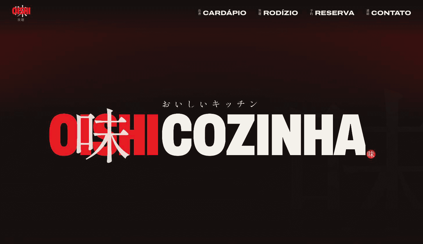
Oishi Cozinha Japonesa hero with the 味 kanji set inside the hinomaru disc01 / 05
Oishi Cozinha Japonesa hero with the 味 kanji set inside the hinomaru disc
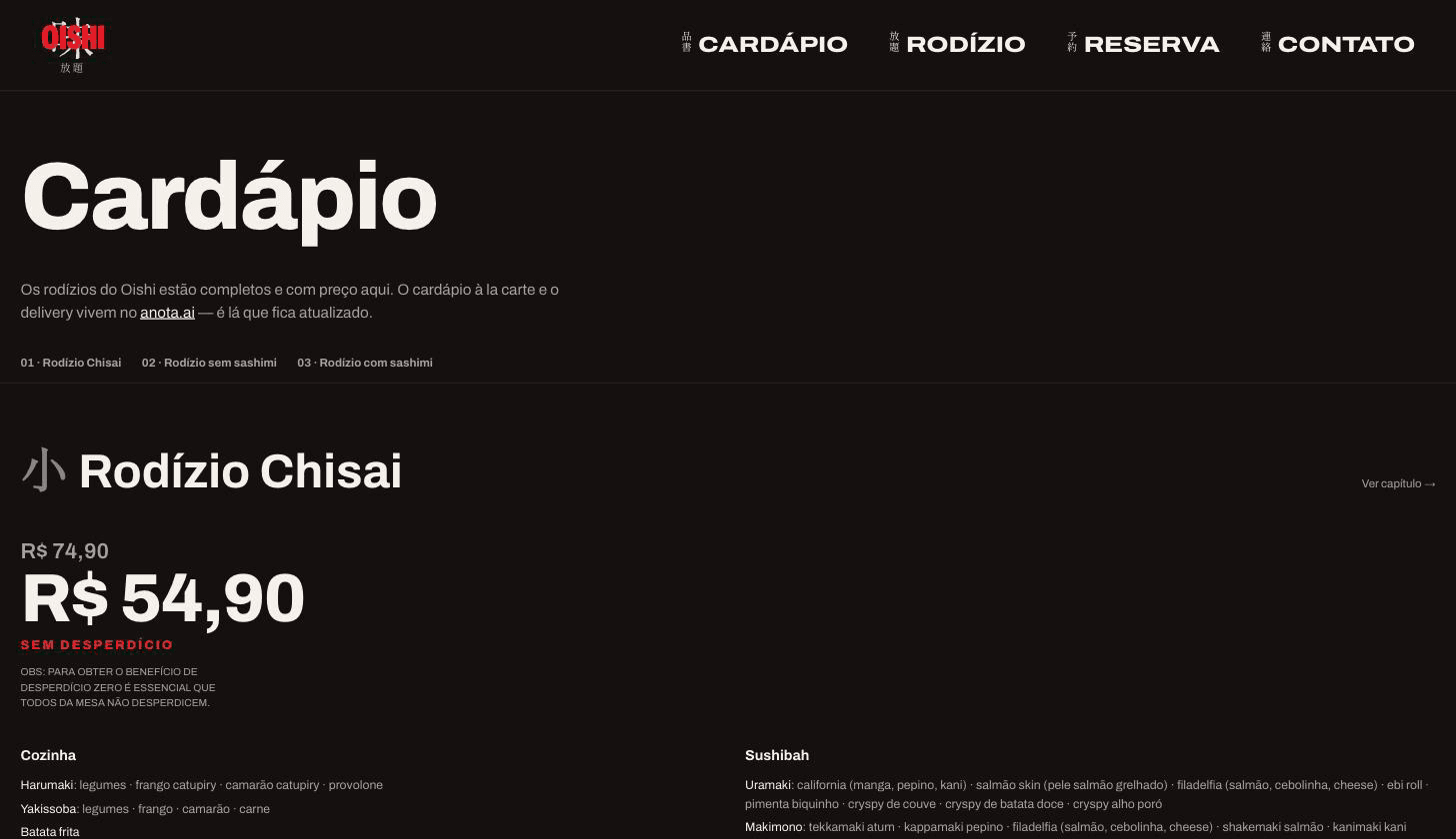
Rodízio Chisai showing both prices, R$ 74,90 and R$ 54,90, with the sem-desperdício condition02 / 05
Rodízio Chisai showing both prices, R$ 74,90 and R$ 54,90, with the sem-desperdício condition
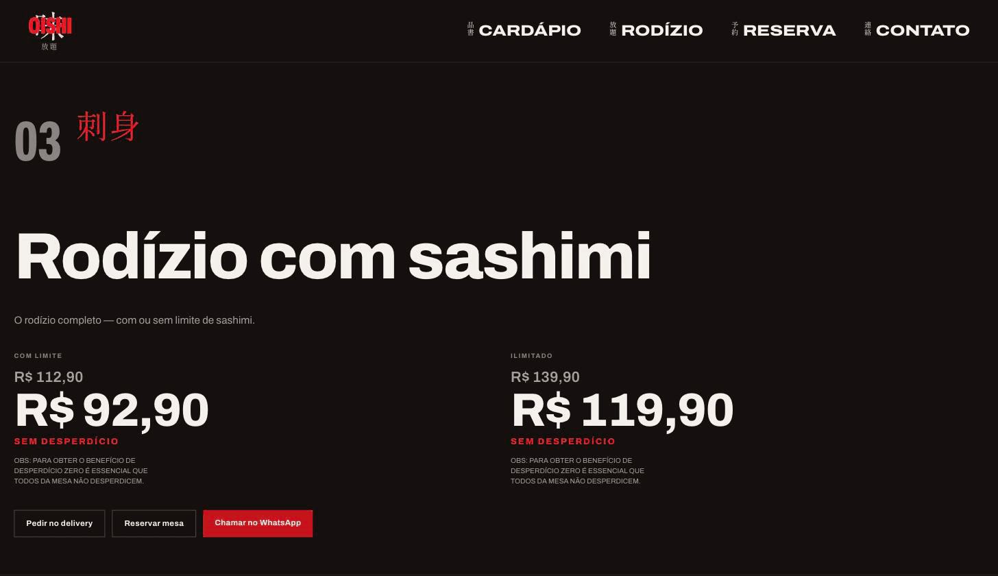
Rodízio com sashimi's two tiers, each with both prices and all three conversion exits03 / 05
Rodízio com sashimi's two tiers, each with both prices and all three conversion exits
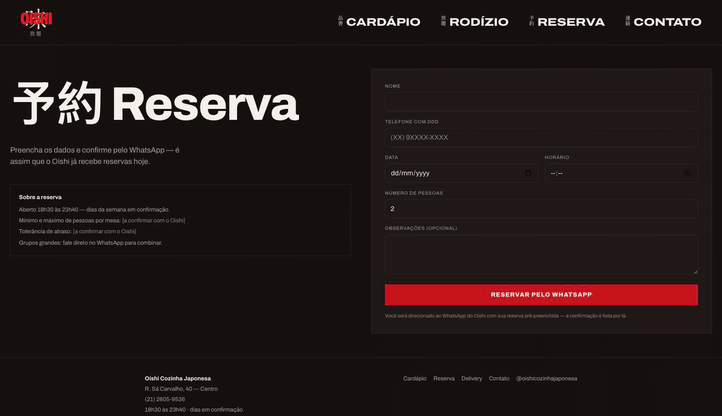
Oishi's reservation form, ending in a pre-filled WhatsApp message, with unconfirmed policy fields marked honestly04 / 05
Oishi's reservation form, ending in a pre-filled WhatsApp message, with unconfirmed policy fields marked honestly
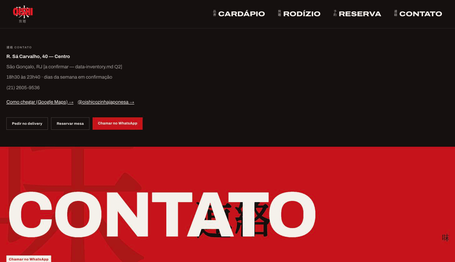
Oishi's contact page with the real address and phone, and an honestly flagged unconfirmed city detail05 / 05
Oishi's contact page with the real address and phone, and an honestly flagged unconfirmed city detail

— Delivery process

From operating constraint to shipped system

The work is sequenced around risk. Domain rules and failure states come before interface polish; automation arrives before handoff.

01

Measure before designing

44 reference photographs were graded by mean luminance with ffmpeg before any layout decision — 15 survive full-bleed, 20 work only in a framed panel, 9 are thumbnail-only, and none show the room or the team.

02

Sample the brand instead of choosing it

The hinomaru's red is a real vertical gradient sampled from the logo itself, not a stock 'Japanese red' — measured at 3.17:1 contrast on the ground colour, which is why it's reserved for fills and display type rather than body copy.

03

Build the two-price component once

Every rodízio tier renders through one component that always shows both prices and the verbatim condition — never the discounted number alone, never the full price without the offer beside it.

04

Register every allowed fact

A data-inventory document tracks every price, hour, and detail the site is allowed to state, each with its source — anything not in that register doesn't reach the page; it renders as '[a confirmar]' instead.

— System architecture

Clear boundaries, explicit responsibilities

Each layer has one job and a narrow contract. That keeps external services replaceable and product behavior testable.

Next.jsTypeScriptTailwind CSSGSAPLenisMotion
oishi_cozinha_japonesa.sys● online

rodízio chisai

R$ 74,90 R$ 54,90

sem desperdício — mesa toda

fotos usáveis

15 de 44, medidas

nenhum preço sem a condição

saídas / 3

delivery[x]
reserva[x]
whatsapp[x]
cardápio registrado[x]
hora confirmada[ ]
coma tudo, pague menos
Client

Next.js App Router

Five static routes — home, cardápio, rodízio/[slug], reserva, contato — no server data, no database.

Motion

GSAP + Lenis + Motion

Scroll-scrubbed cinema on the home route, smooth native scroll everywhere, component-level hover and reveal motion.

Content

Typed TS, no CMS

Menu, prices, and facts live in src/content/, gated by the same 'never invent a fact' rule enforced across the codebase.

Conversion

lib/contato/whatsapp.ts

The one wa.me builder every CTA on the site resolves through — delivery and reservations both terminate here.

— What shipped

Product capabilities

01

The two-price component

Every tier always shows the full price, the anti-waste price, and the real condition together — never one number alone.

02

Luminance-graded photography

Every photo on the site is shown at the size its own measured brightness actually supports, never stretched past its tier.

03

Honest unresolved facts

An unconfirmed hour, phone digit, or reservation rule renders as a visible '[a confirmar]' instead of a plausible placeholder.

— Engineering pressure

Challenges resolved

01

A phone number that disagreed with itself

WhatsApp deep links and two social posts gave one number; two printed flyers gave another. The conflict is contained to one builder function so the site can ship around it without resolving it everywhere it's used.

02

Designing without a photo shoot

Two-thirds of the 44 reference photographs measured too dark or too inconsistent for a photography-led design, so the entire visual system had to carry the brand through type and colour instead of imagery.

03

Keeping the discount honest, not just prominent

The anti-waste price only applies if the whole table finishes its food — showing R$ 54,90 without that condition would be a false price, so the condition is structurally part of the same component, never separable copy.

next transmission

Need a system this deliberate?

Bring the operating problem. We will shape it into a clear product brief and a buildable next step.

Start a project